
tonic & CO
Tonic & Co is a go-to-market consultancy helping private equity-backed B2B businesses unlock growth. Working as a fractional CMO, they combine strategic thinking with hands-on marketing expertise to sharpen positioning, generate demand and align sales and marketing, helping ambitious businesses build stronger, more effective routes to sustainable growth.
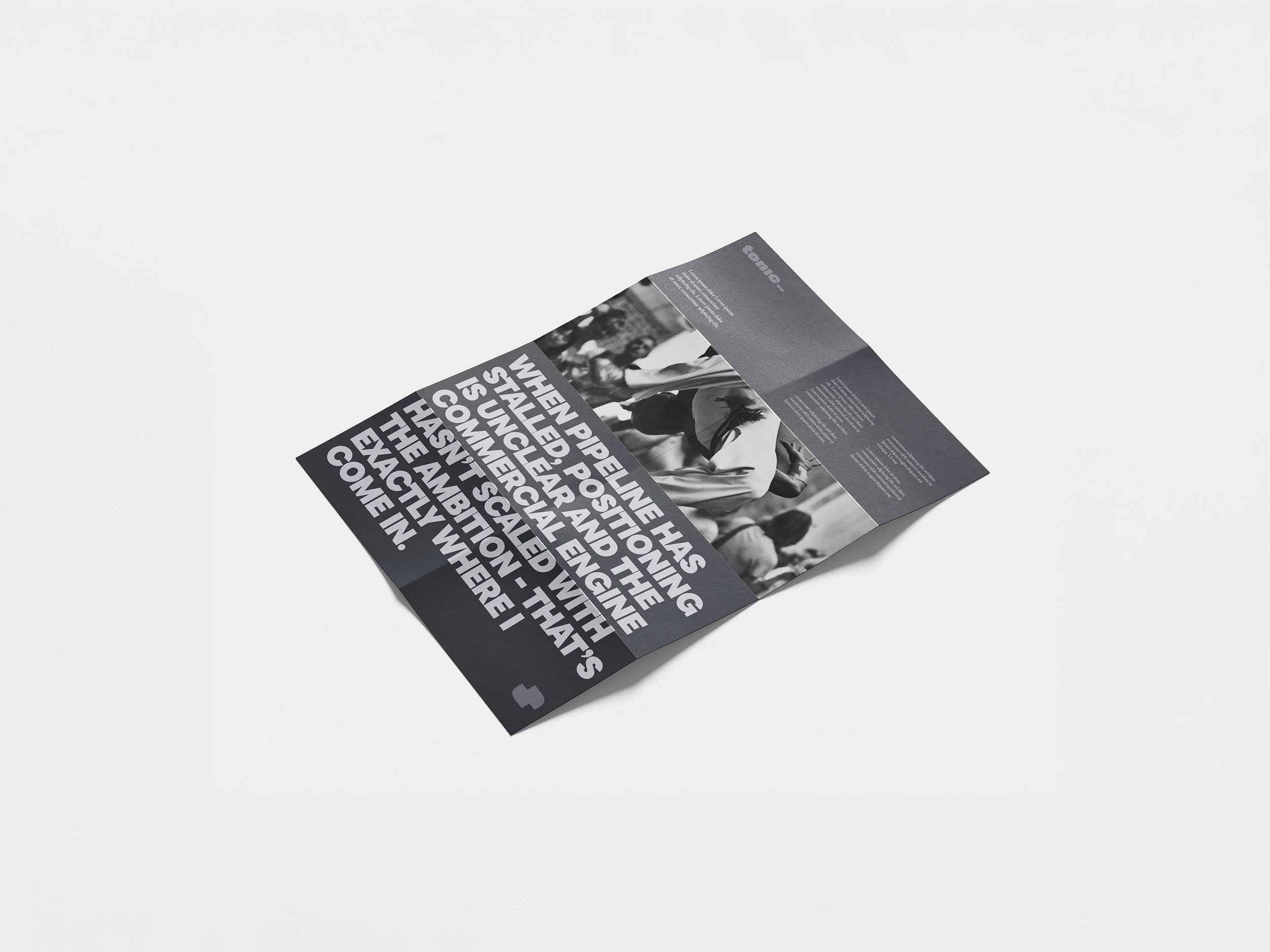
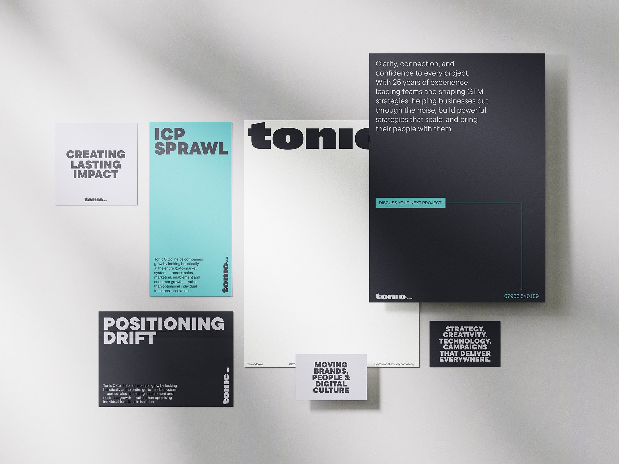
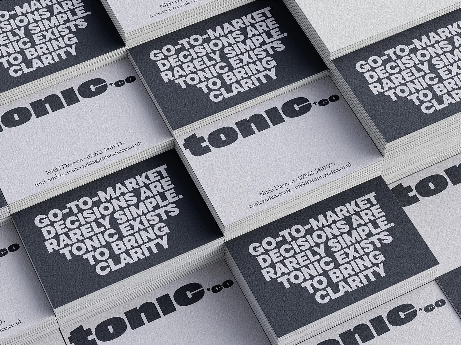
As a start up business they need their brand created and a website built. The brand identity was designed to reflect Tonic & Co’s confident, energetic and commercially focused approach. A bold typographic style, vibrant colour palette and distinctive graphic language create a contemporary identity that feels both professional and approachable, giving the brand the flexibility to stand out across digital platforms and marketing materials.
LOGO DESIGN | BRANDING | WEB DESIGN
You may also like to look through these other projects


